
Branding Basics for a Service Business: Name, Logo, Colors, Truck
You don't need a brand book. You need four things to look consistent everywhere a customer sees you, and here's the order to do them in.
Somebody has tried to sell you a brand book. Maybe it worked.
Forty pages. A mood board, four logo lockups, a color story, and a page describing your company’s personality as if it were a guy you’d meet at a cookout. Five figures, sitting in a folder nobody has opened since.
Meanwhile your invoice still has the old logo, the truck lettered in 2021 is a different green than last spring’s, and the yard signs say “Heating & Air” while the website says “HVAC Services.”
That’s the actual problem. It isn’t a strategy problem.
Branding for a service business comes down to four decisions: a name people can spell over the phone, a logo that reads at one inch on an invoice and at six feet on a truck door, two colors with one font, and a photo standard. Use them everywhere without exception. You don’t need a brand book. You need the truck, the shirts, the signs and the paperwork to match.
Branding for a service business is four decisions, not a document
You’re not a bottle on a shelf next to eleven identical bottles. Consumer brands pay for association because the product can’t argue for itself. Yours can. You show up and you fix the thing.
So your brand has one job: get recognized. When a water heater lets go on a Saturday, you want the homeowner to feel like they’ve heard of you before they’ve heard of you. That comes from seeing the same shapes and colors where they live, not from a positioning statement.
Four decisions get you there. The rest is discipline.
Decision one: a name you can say over a bad phone connection
Say it to somebody who has never heard it, with road noise in the background. If they spell it back wrong, you’ll pay that tax forever in misspelled searches and mail that goes nowhere.
Two traps, both of which show up years later. Don’t box yourself into one service: “Raleigh Drain Cleaning” is fine until repiping is half your revenue and every customer assumes you don’t do it. Don’t box yourself into one town either. Johnston County has grown 18.7% since 2020, fastest in the region, and Wake County adds roughly 66 residents a day. Companies named after Cary in 2019 now do most of their volume in Clayton and Fuquay-Varina.
There’s a temptation to stuff a keyword in, because keywords in your Google Business Profile title scored 223 points in Whitespark’s 2026 survey of 47 local search experts, third highest of 187 factors. It works. It also gets profiles suspended when the name doesn’t match the truck and the license. Use your real name.
If the name is boring rather than actively wrong, keep it. Renaming after you have review volume restarts recognition from zero, and reprinting is the cheap part.
Decision two: a logo that works at one inch and at six feet
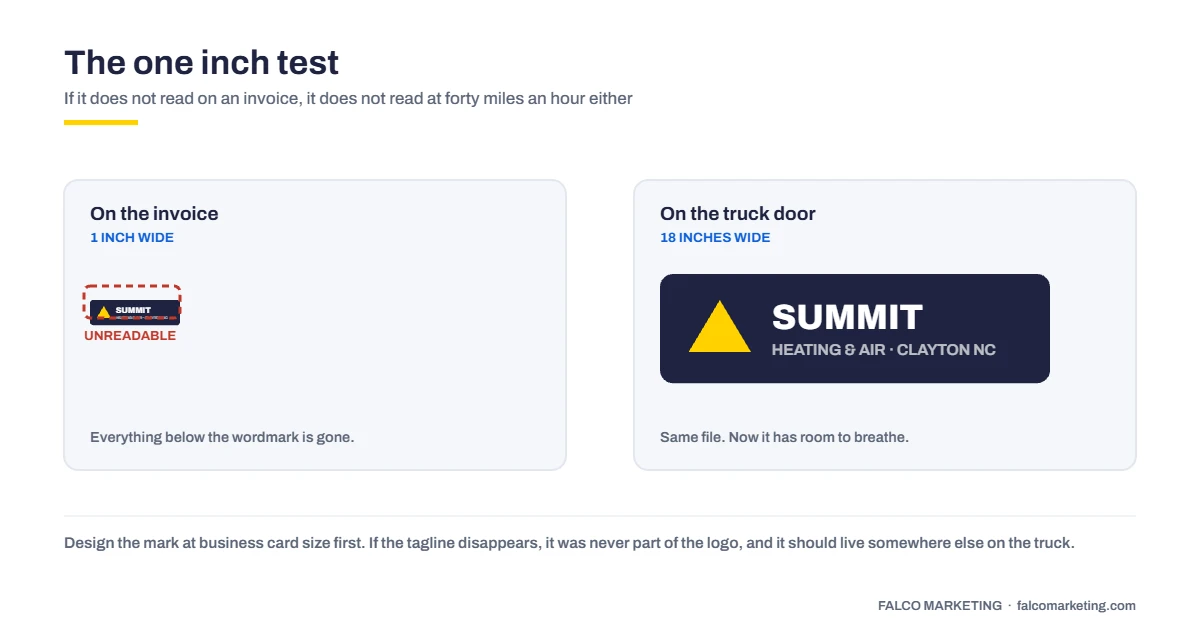
This is the test that kills most logos, and almost no designer runs it before presenting.
Print it at one inch wide, the size it lands on an invoice. Then picture it on a truck door read across a parking lot. If the tagline turns to mush, or the mark vanishes into the door panel, it failed. Doesn’t matter how good it looked on a laptop.
What survives both: heavy strokes, high contrast, few pieces, and a version that works in one solid color. What fails: thin script, gradients, four colors, a detailed house with shingles you can count, a tagline in 8-point italic.
You need all of these files before you sign off, and you should own them.
- Vector source (.ai or .eps) plus PDF, because vinyl cutters and embroidery shops need vector, not a JPEG pulled off your site
- A one-color black version for forms and single-color printing
- A reversed version for dark backgrounds, which is most vehicle lettering
- A horizontal lockup and a stacked one, because a truck door is square and a sign band is not
Decision three: two colors and one font
Two colors. One dark and one bright, or one dark and one neutral. Done.
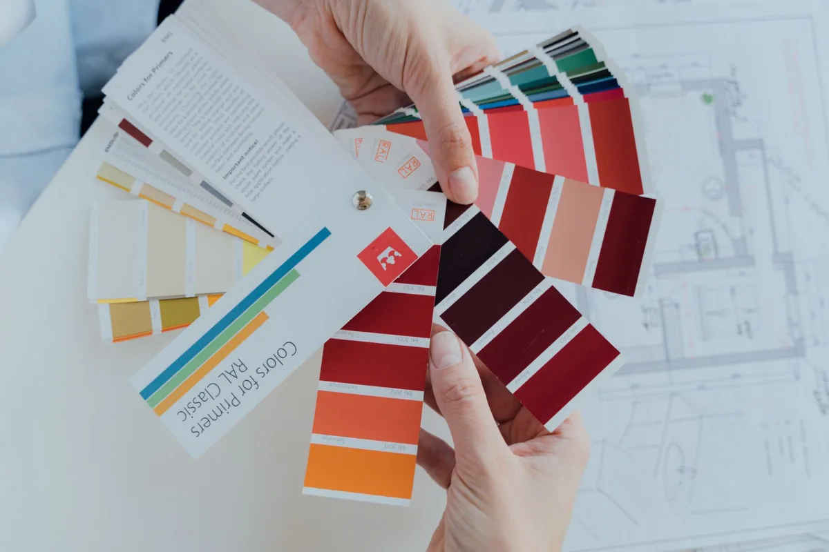
Write them down four ways, because the same green is a different green in every medium: hex for the website, CMYK for print, a Pantone number for spot printing, a vinyl series for signs. If your sign shop and your shirt vendor are each guessing at “our green,” you’ll get two greens, and you’ll see them parked side by side at a job site.
One font family, two weights. Bold for headings, regular for the rest. Pick something that doesn’t fall apart in embroidery, where thin letters turn into thread bumps. Every extra color past two is another chance for a vendor to improvise.
Decision four: a photo standard
Your photos do more brand work than your logo does, and most owners never make a single decision about them.
You don’t need a photographer on retainer. You need a rule the crew follows. Daylight, branded shirt, clean truck in frame, before and after from the same angle, no thumb in the corner. Those photos go on the Google Business Profile, the site, the ads and the mailers, and everything starts to look like one company.
Stock photos of a model in a clean hard hat do the opposite. People in Apex can tell.

Your truck gets seen more than your website does
Here’s the part the brand deck skips.
Count the impressions honestly. A lettered truck sits in a driveway for four hours where six neighbors see it, then drives home through Garner at 5pm. A yard sign sits at the curb for two weeks. Every invoice, every estimate, every door hanger, every polo at the hardware store. Now count your website visits.
The web number is softer than it looks. 68.01% of Google searches ended without a click in early 2026, up from 60.45% in 2024. Plenty of people who look you up never reach your site. They see your name, your rating and your photos on a map card and decide there and then.
So the physical stuff isn’t leftover budget. It’s most of your surface area.
The pattern we run into most on audits around Raleigh: four versions of the logo in circulation. The original from the sign shop, a redrawn one somebody’s nephew made in Canva, a low-res JPEG with a white box around it that the shirt vendor has used since 2019, and a “new” one that only ever reached the website. Usually two phone numbers, too.
That’s a file management failure, not a strategy failure, and it’s fixable in about a week.
| Where you appear | Read from | What it has to survive |
|---|---|---|
| Invoice, estimate, card | 12 inches | One color and small type on a bad office printer |
| Polo and hoodie | 3 to 6 feet | Embroidery, which eats thin strokes and fine detail |
| Yard sign | 20 to 40 feet at 35 mph | Two colors and a phone number you can read at speed |
| Truck door and rear | 6 feet parked, 40 feet moving | High contrast on a dark or metallic panel, no gradients |
| Google profile and site | A phone screen | A square crop that isn’t cut off, plus real photos |
Caption: Four decisions, applied to every surface a customer sees.

Fix the files before you order anything else
Send us whatever logo versions you can find, even phone photos of the truck, and we’ll rebuild a clean vector set: one-color, reversed, horizontal, stacked, with your colors specified in hex, CMYK, Pantone and vinyl. Design and print both run in-house here, so the files come back ready for the sign shop. You own them whether or not you print with us.
See how design and print worksSend us a photo of your truck and we’ll tell you what’s wrong with it.Why consistency is cheaper than buying the same customer twice
Someone who remembers your name types your name. Someone who doesn’t types “AC repair near me,” and now you’re bidding against four companies for that click.
Home and home improvement advertisers paid a median $8.33 per click in WordStream’s 2026 benchmarks across 13,474 US search campaigns, at $90.92 per lead. Legal is worse: $9.87 a click, $131.63 a lead. Branded searches are the cheapest traffic in the account, and they close better because the person already decided.
A truck that looks like a real company, parked in a neighborhood all day, buys you branded searches. It only compounds if it’s the same truck every time. Four logo versions means four weak impressions instead of one strong one, and a neighbor who never connects Tuesday’s van with Friday’s yard sign.
How to fix this in a week without redoing your identity
Assume the name and logo are staying.
- Find every logo version in circulation. Trucks, shirts, invoice template, website footer, Google profile, last mailer. You’ll usually turn up three or four.
- Pick the one that survives the one-inch and six-foot tests, then have it rebuilt as clean vector art. Redrawn, not auto-traced.
- Write the one-page spec. That page is your entire brand book.
- Send it to every vendor you use, including the ones you inherited.
- Replace in order of visibility and cost. Digital first, since it’s free: website, Google profile, email signature, invoices. Then shirts at the next reorder, then signs. Trucks last.
Don’t rewrap five trucks in one month. Nobody notices the transition, and doing it all at once is how owners end up quitting halfway.
The one-page spec, in full
- Logo: vector source, one-color, reversed, horizontal and stacked
- Color one and color two, in hex, CMYK, Pantone and vinyl series
- One font family, bold and regular
- Photo rule: daylight, branded shirt, before and after from the same angle
- The company name, spelled and punctuated one way, everywhere
What this should cost
A logo rebuild plus a one-page spec is a small project and should be priced like one. If you’re quoted five figures for brand strategy before anyone asks what your truck looks like, you’re buying a document.
Where a professional earns the money is production art. Vinyl needs different files than embroidery, and a shop handed a bad file either charges a setup fee or quietly fixes it and bills you anyway. That’s the part of our design and print work that saves owners the most.
What “consistent” actually means
A customer who saw your truck Tuesday, got a mailer Thursday and found your website Sunday can tell all three came from the same company without thinking about it.
Frequently asked questions
Do I need a brand book for my service business?
No. The one-page spec above covers everything a vendor actually needs, and a spec your sign shop can follow beats 40 pages about brand personality.
Should I put keywords in my business name?
No. Keywords in the Google Business Profile title carry real ranking weight, but the profile name has to match your truck and your licensing. Mismatches are a leading cause of suspension, and a suspension costs more than the ranking gained.
Do vehicle lettering and yard signs actually work?
They get seen more often than your website does, and nobody can honestly quote a response rate for them, so treat any agency that does with suspicion. The effect is indirect: people who recognize your name search for your name, which beats $8.33 a click for a generic search.
How do I know if my branding is inconsistent?
Photograph everything in one afternoon: both sides of every truck, a shirt, a yard sign, an invoice, the website header and your Google profile. Lay them side by side. More than one logo version, more than two colors or more than one phone number means you have this problem.
Twenty minutes, and you’ll know what to fix first
Get on a call and walk us through what you’ve got. We’ll tell you whether your logo passes the one-inch and six-foot tests, which surfaces to fix first, and what it costs. No proposal, no follow-up sequence. If the answer is “your branding is fine, spend the money on your website,” we’ll say that.
Book a 20-minute callOr read what other Triangle owners say about us first.